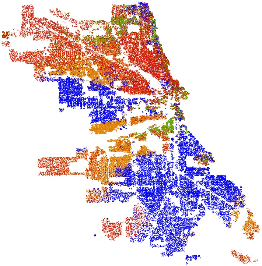
Racial distribution from the 2010 US census for the Chicago incorporated metropolitan area. Red is white, Blue is black, Green is Asian, Orange is Hispanic, Yellow is “other,” and each dot is 25 residents.
Why are some US cities far more violent than others? For instance, why does Chicago appear to have nearly three times as much violent crime per capita as do New York City and Los Angeles? I test the hypothesis that racial segregation and violence go hand-in-hand.
Are higher levels of racial segregation in large metropolitan areas positively correlated with higher levels of violent crime?
To answer this question, I used demographic data from the Census 2010 Public Law data release for redistricting. For each state there are three data files, two of which are needed for this analysis. One of these files contains geographic information on a variety of scales, and the second contains the necessary racial demographics. Each line has a record number to match the racial data with the geographic data. I chose block-level data and defined each city to be the incorporated area, located via “place” code.
Segregation is defined in terms of the Index of Dissimilarity of each minority group with respect to the majority for each city. The overall segregation statistic S is defined to be the population-weighted mean of the Index of Dissimilarity for the six census-designated minority races.
The violent crime data come from the Federal Bureau of Investigation Uniform Crime Reports, where V is defined to be the number of violent crimes per 100,000 people for the calendar year 2011.

Number of violent crimes per 100,000 people for the calendar year 2011 plotted versus the segregation index S from the 2010 US census, for cities with over 500,000 residents. The most notoriously violent cities are highlighted as the larger, colored dots: Chicago is blue, Detroit is red, Memphis is orange, and Baltimore is green. The dashed line is the linear regression.
The Pearson correlation coefficient is 0.6, which for a sample of this size indicates a highly statistically-significant positive correlation. It is further clear that the most notoriously violent cities — e.g. Chicago, Detroit, Memphis, and Baltimore — are some of the most segregated.
